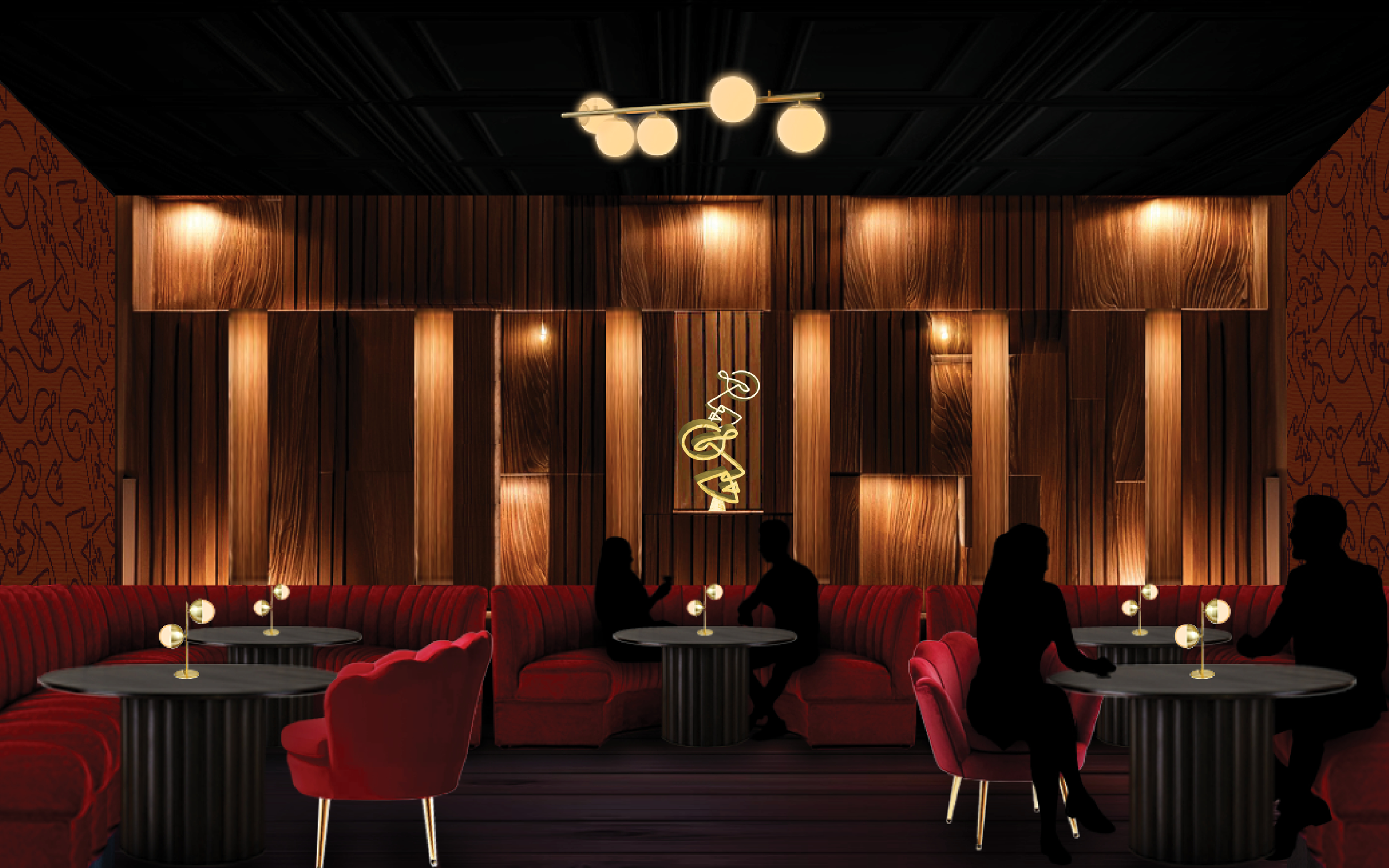
The curved booth and the curved chair are used in the restaurant to act as if they are hugging the guests to create a safe feeling environment. For the fabric, velvet is very sensory rich. It has a soft and smooth texture that gives touchable pleasure by just gliding your hand over the material.
Round shapes are more soothing shapes and seen as less threatening due to there being no harsh angles. The 5 round bulbs on the ceiling represent the 5 senses that Spiga stimulates. The 2 round bulb table lamp symbolizes taste and hearing since they are placed on the dinner tables where the area is filled with intimacy and great food.
My motivation for this project is to create a spatial design that aligns with Spiga’s intimate, romantic, and welcoming atmosphere—something the current space lacks. With food of such high quality, the environment should match that excellence and leave a lasting impression.
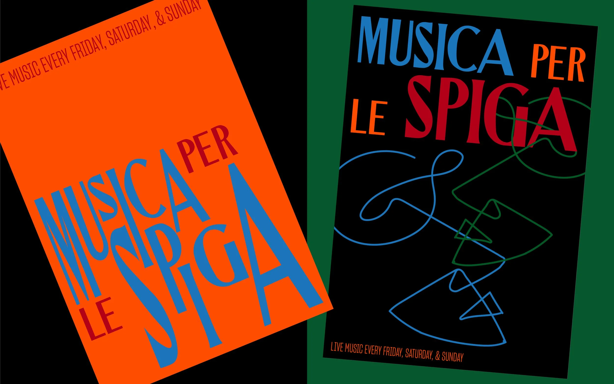
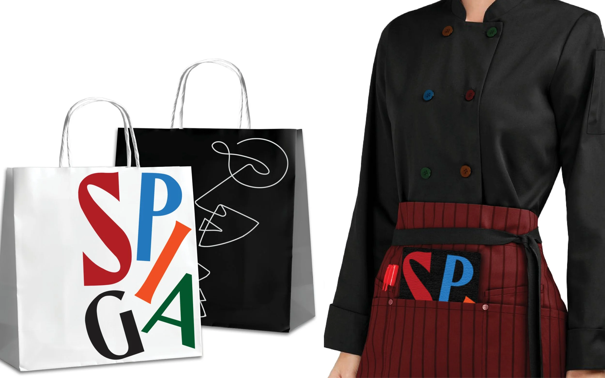
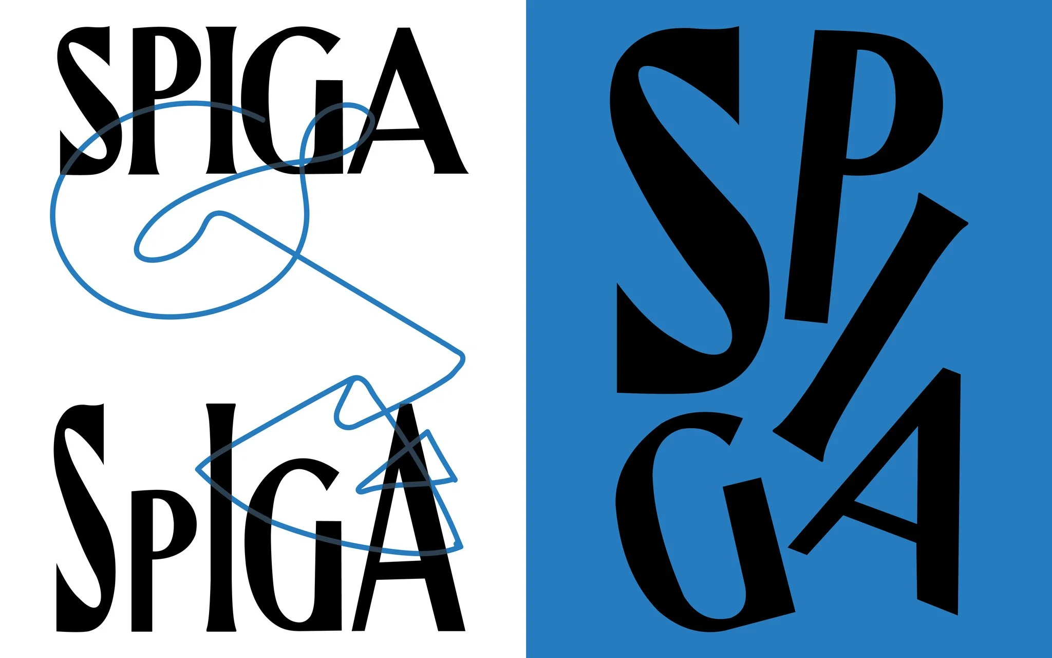
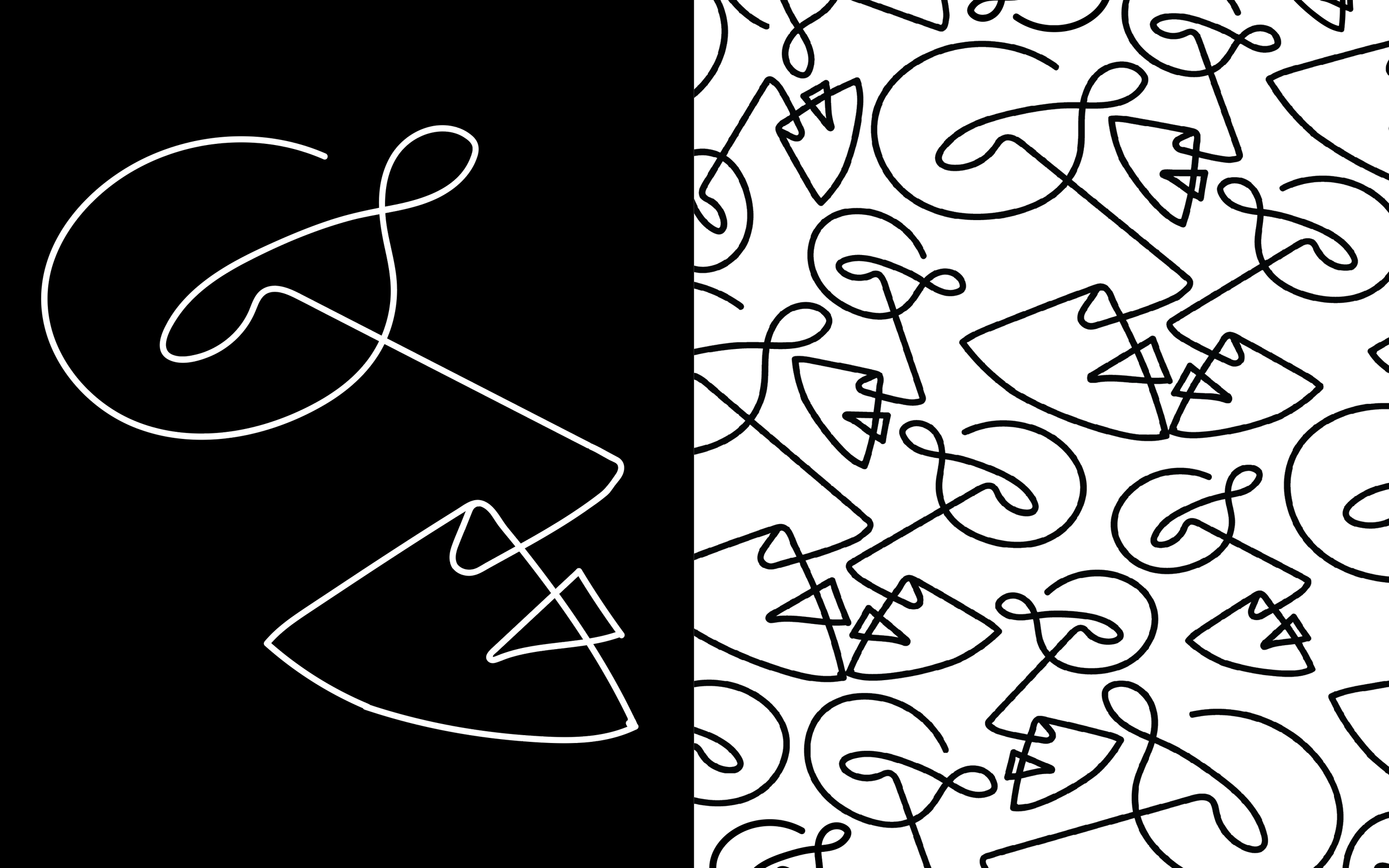
In researching the restaurant, I discovered “Spiga” means “ear” in Italian. Paired with the logo’s inspiration from the sound poem Zang Tumb Tumb by Italian futurist Marinetti, my concept evolved into a sensory experience. By incorporating all five senses—hearing, sight, smell, taste, and touch—I aim to design an environment that fully satisfies guests from every angle. I want to use this idea of sound that we see in the restaurant name, the poem inspiration, and the live music aspect as a way to redesign the currently underwhelming environment of Spiga. This concept also translates into my secondary logo, a wire drawing of a face that subtly mirrors the shape of an ear. This drawing was then transformed into a pattern, creating the illusion of faces interacting with one another. The pattern on the left is the wallpaper design implemented in the dining area.
Gold - Graphis New Talent Awards 2025
Silver - Indigo Design Awards 2025


